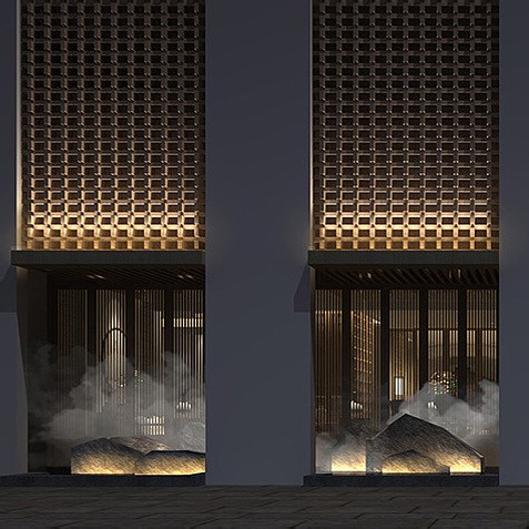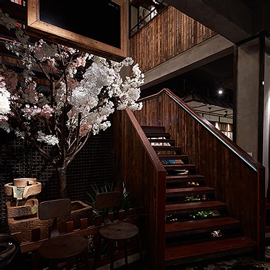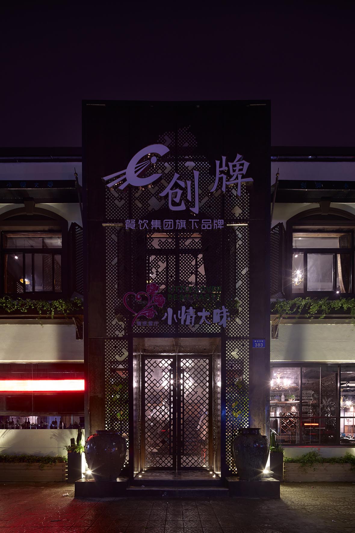
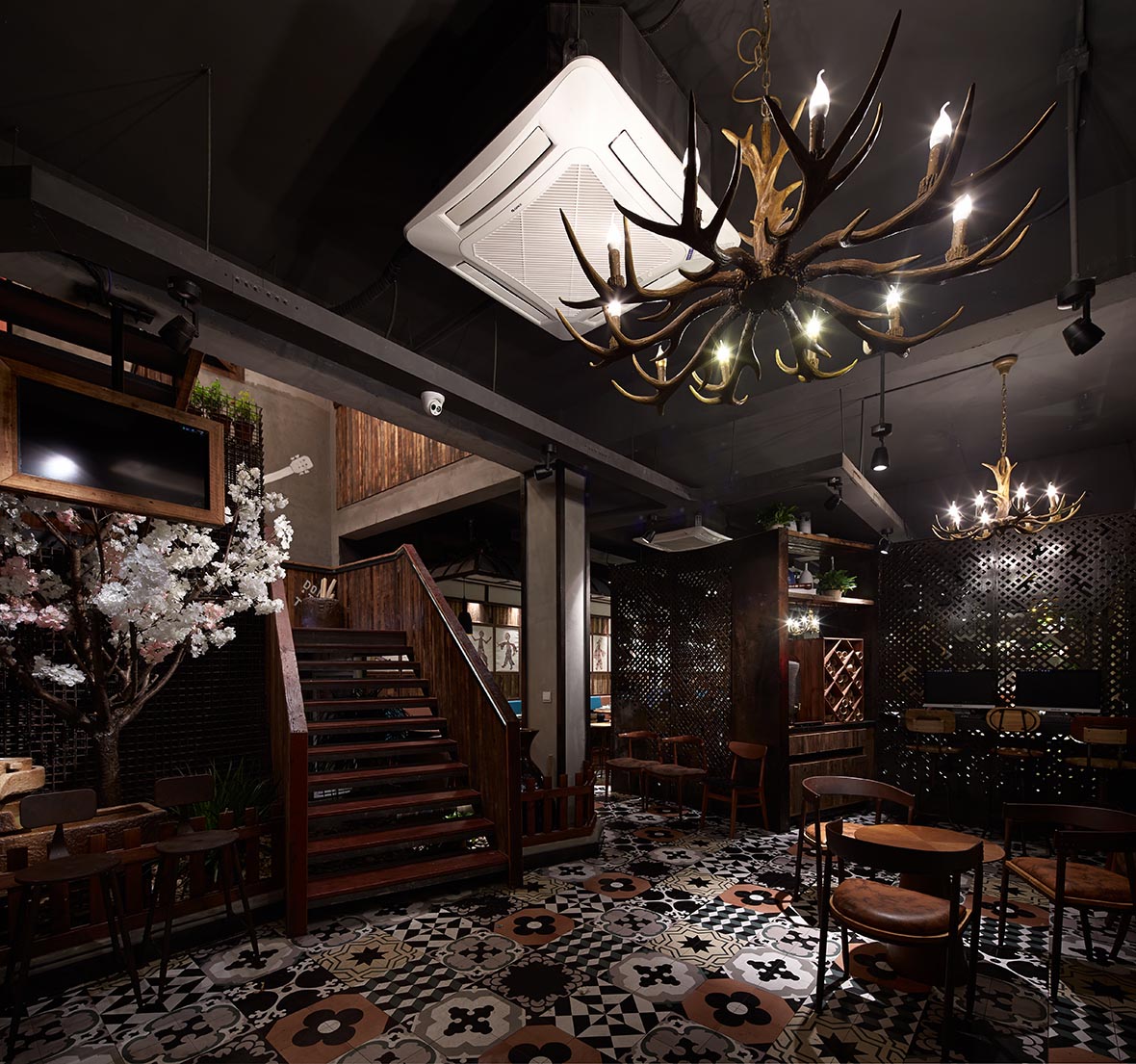
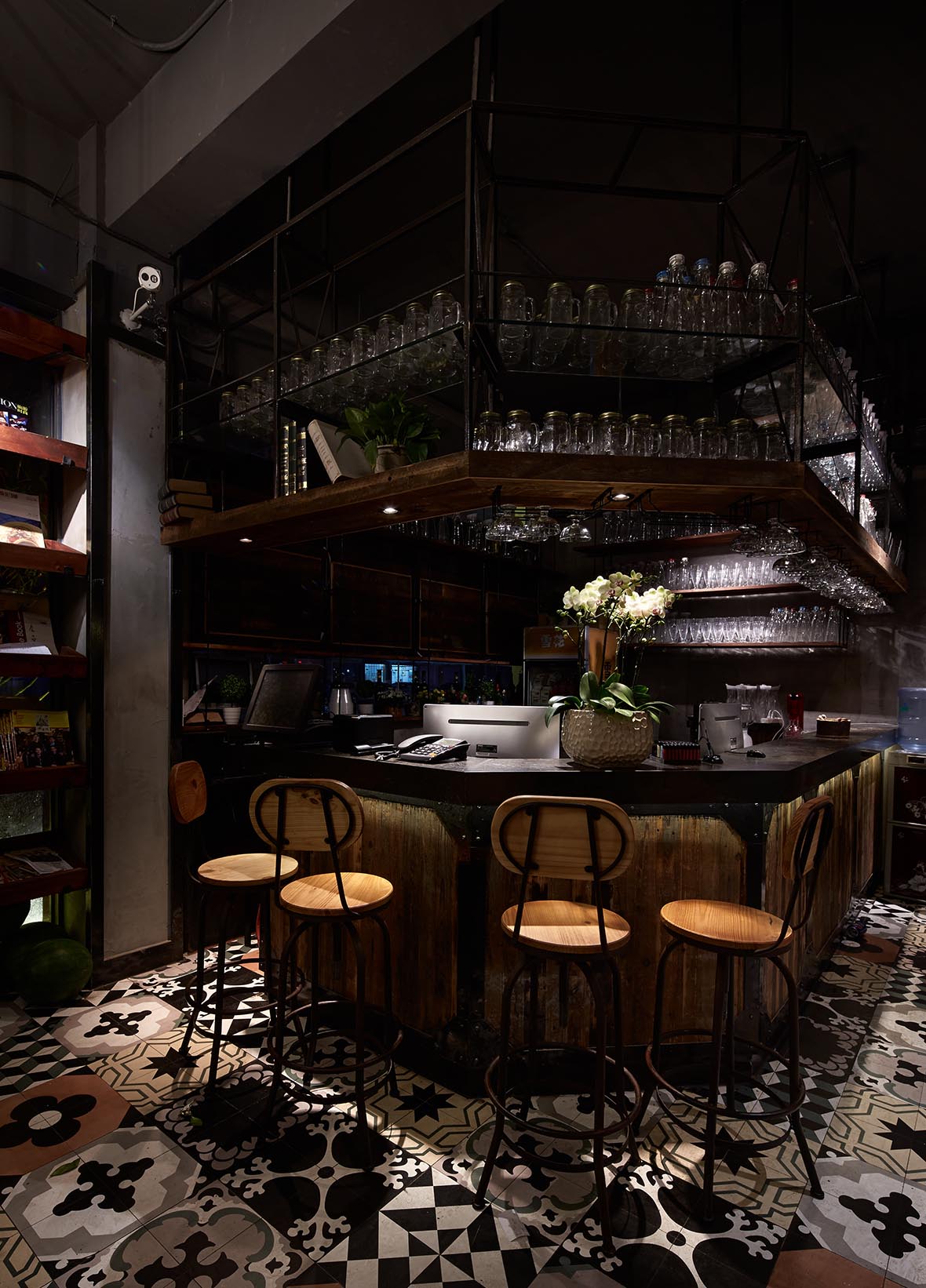
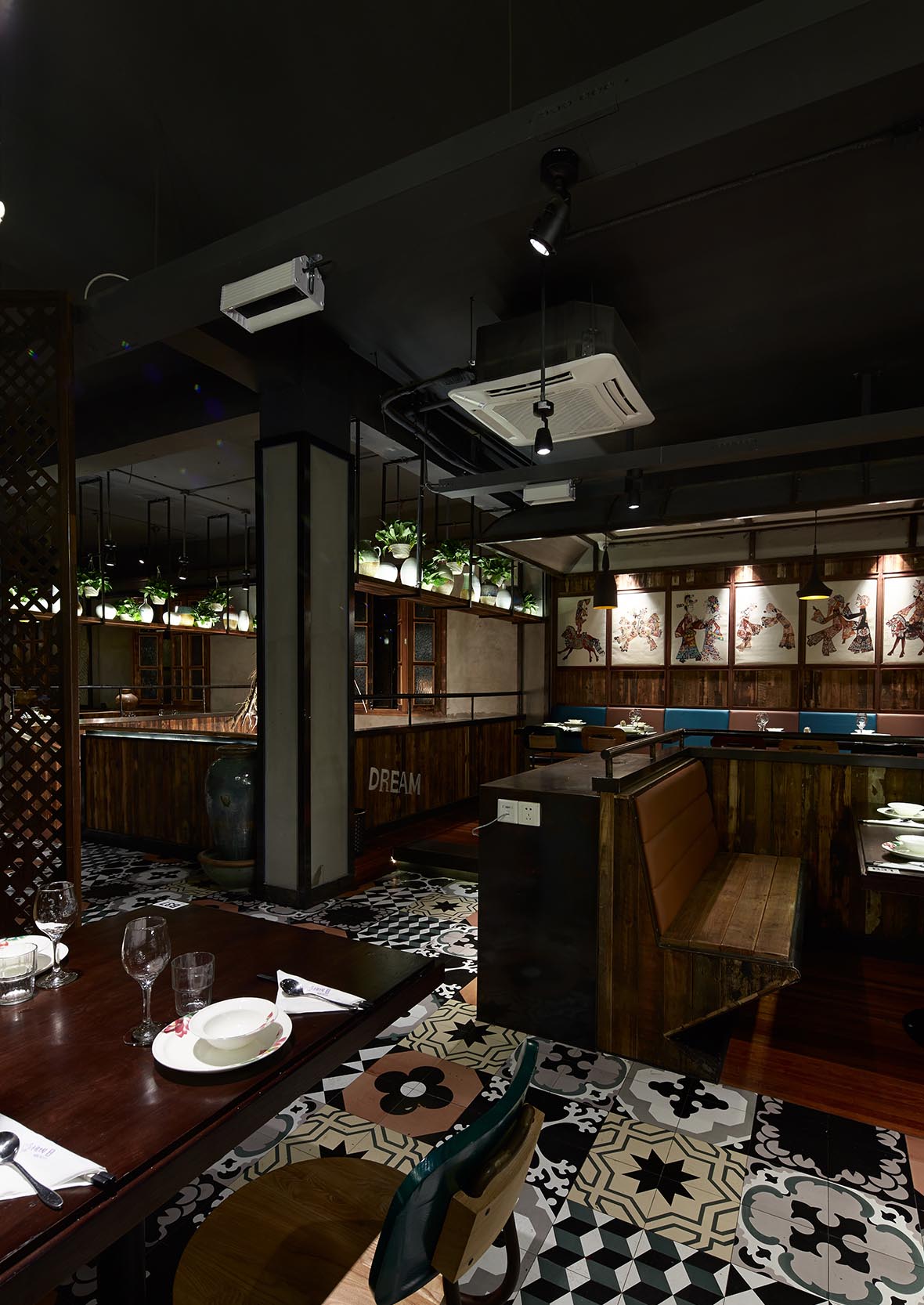
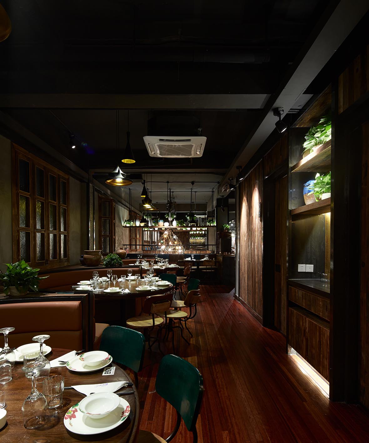
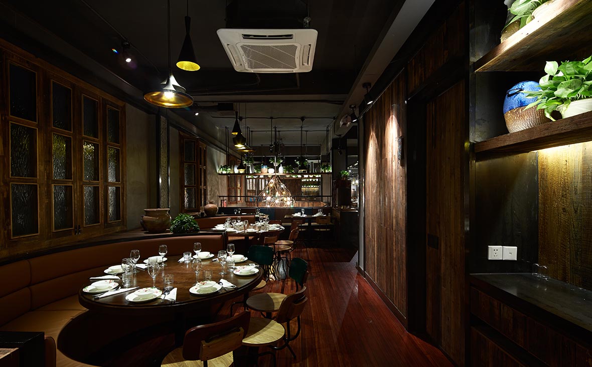
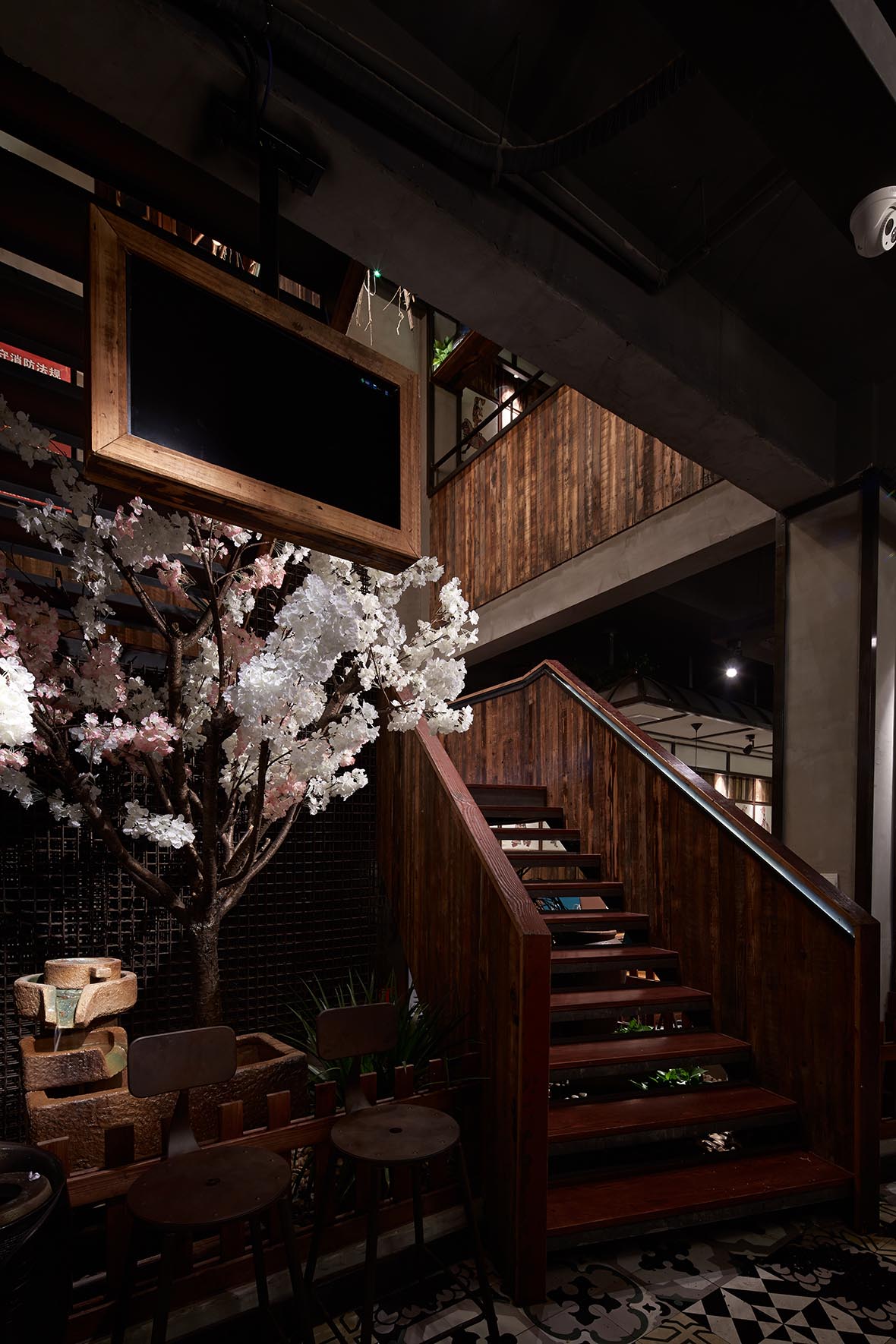
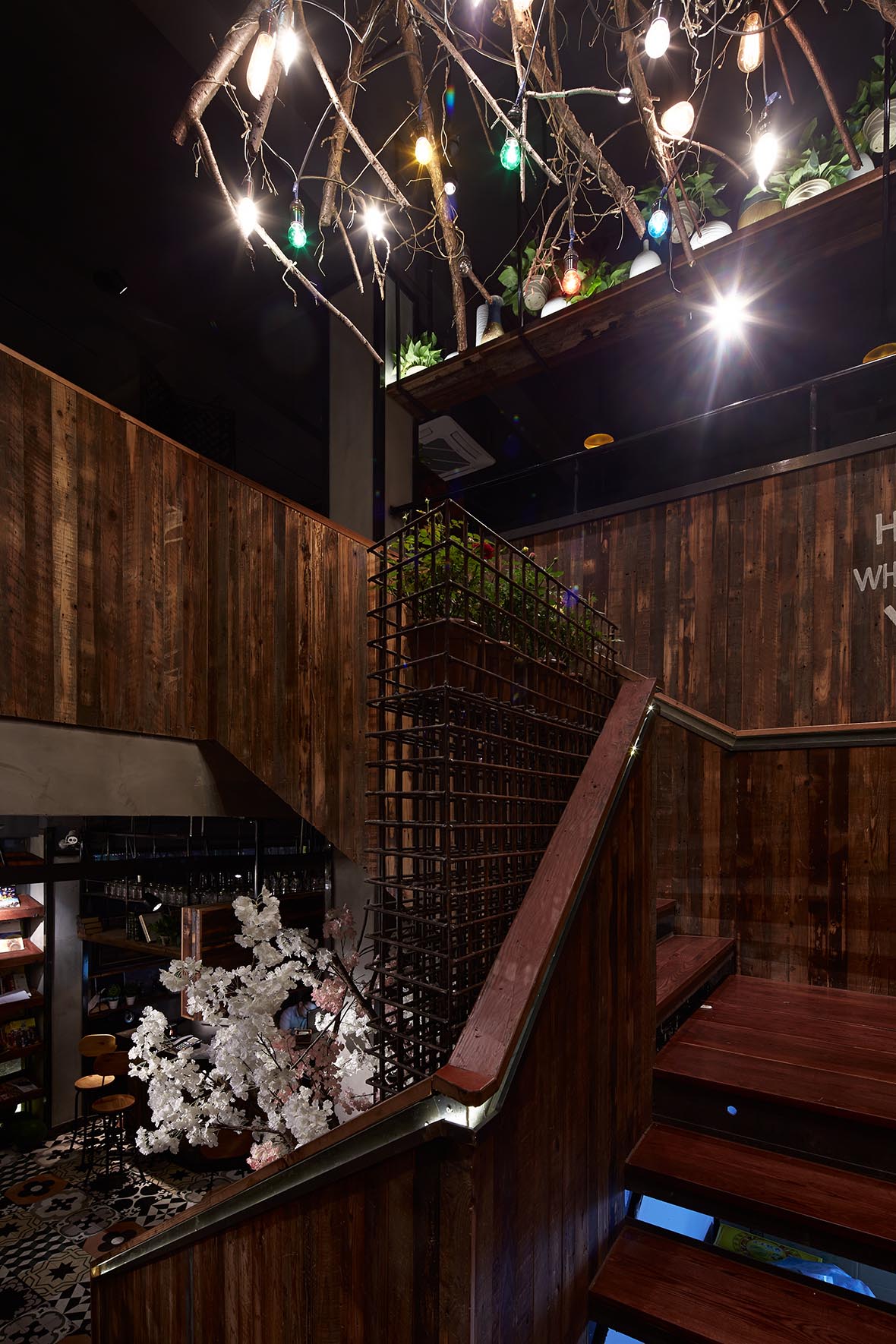
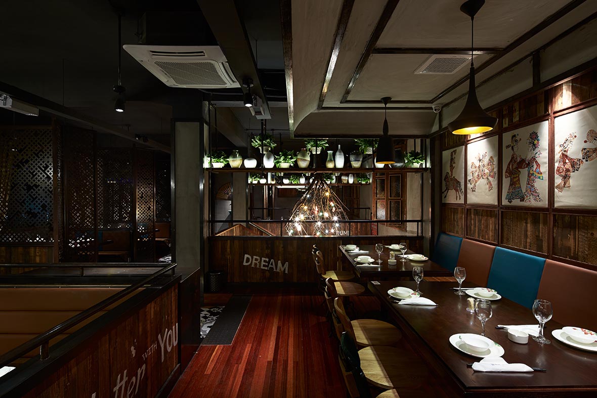
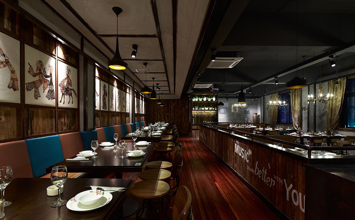
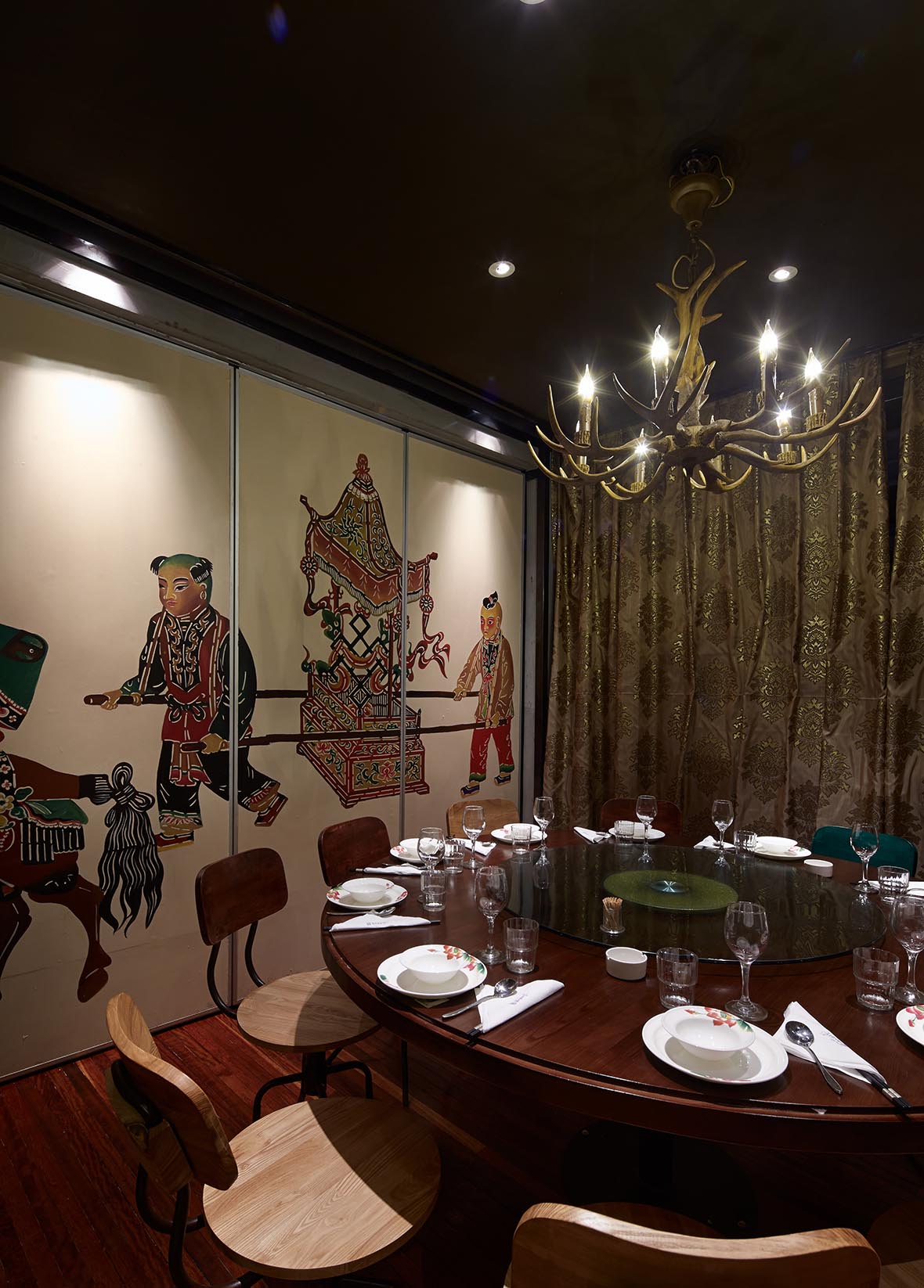
項目前生是一家經營不善的餐廳,裝修平淡俗氣,我們在接到此項目的時候甲方要求在原裝修基礎上局部改動,新餐廳定位以80後消費人群及家庭消費為主,菜品價格實惠,而且新餐廳主品牌在當地也有一定知名度,經再三考慮我們建議整體格局改變,採用時下流行的工業風,以最少的投入取得煥然一新的新餐廳效果。在格局上我們把樓梯從現在衛生間的位置移至大門入口處,以休息等候區連成一體,第一吸引客流上二樓,第二節省通道,提高入座率,第三樓梯不僅起到了貫穿二樓的交通作用,也是整個店的一道風景。用材上除了保留原柱子水泥效果外,使用了大面積當地舊貨市場購買的舊木板,鏤空腐蝕鐵板以及復古印花磚,軟裝融入了傳統文化元素《皮影》。
The project is a poor management of the restaurant, decoration plain tacky, when we received this project in the original decoration on the basis of partial changes, the new restaurant location to 80 after the consumer groups and household consumption, food prices affordable, And the new restaurant main brand in the local also has a certain reputation, after repeated consideration we recommend the overall pattern change, the use of popular industrial wind, with minimal investment to achieve a new look of the new restaurant. In the pattern of the staircase we are now from the location of the bathroom door to the entrance to the rest area waiting together, the first to attract passenger on the second floor, the second channel to save and improve attendance, not only played the third staircase through the two Floor of the traffic effect, but also the whole shop a landscape. In addition to preserving the original material on the pillars of cement, the use of a large area of local flea market to buy the old plank, hollow corroded iron plate and retro printing tiles, soft fitted into the traditional cultural elements "shadow".

Petty bourgeoisie good taste
創牌﹒小情大味餐廳
項目前生是一家經營不善的餐廳,裝修平淡俗氣,我們在接到此項目的時候甲方要求在原裝修基礎上局部改動,新餐廳定位以80後消費人群及家庭消費為主,菜品價格實惠,而且新餐廳主品牌在當地也有一定知名度,經再三考慮我們建議整體格局改變,採用時下流行的工業風,以最少的投入取得煥然一新的新餐廳效果。在格局上我們把樓梯從現在衛生間的位置移至大門入口處,以休息等候區連成一體,第一吸引客流上二樓,第二節省通道,提高入座率,第三樓梯不僅起到了貫穿二樓的交通作用,也是整個店的一道風景。用材上除了保留原柱子水泥效果外,使用了大面積當地舊貨市場購買的舊木板,鏤空腐蝕鐵板以及復古印花磚,軟裝融入了傳統文化元素《皮影》。
The project is a poor management of the restaurant, decoration plain tacky, when we received this project in the original decoration on the basis of partial changes, the new restaurant location to 80 after the consumer groups and household consumption, food prices affordable, And the new restaurant main brand in the local also has a certain reputation, after repeated consideration we recommend the overall pattern change, the use of popular industrial wind, with minimal investment to achieve a new look of the new restaurant. In the pattern of the staircase we are now from the location of the bathroom door to the entrance to the rest area waiting together, the first to attract passenger on the second floor, the second channel to save and improve attendance, not only played the third staircase through the two Floor of the traffic effect, but also the whole shop a landscape. In addition to preserving the original material on the pillars of cement, the use of a large area of local flea market to buy the old plank, hollow corroded iron plate and retro printing tiles, soft fitted into the traditional cultural elements "shadow".
设计师:沈城强
